
 Backdrop for a temporary title screen - Fall of 1996
Total Annihilation came together fast. Really fast. The bulk of the game's code and content was created in less than a year. I credit this to two things: insane work hours and a good preproduction phase.
Preproduction is frequently overlooked and underestimated by publishers and game developers, even today. Taking the time to figure out tools, techniques and a look for a game sounds like good sense, but it is often written off as indulgent fluff. It doesn't always feel like you're producing something, and it's sometimes hard to show that you are (especially to a stressed out executive) but preproduction is incredibly useful. It gets a solid production pipeline in place, and makes it easier for a small core team to share the Kool Aid and quickly indoctrinate new recruits. I firmly believe that every week of preproduction saves at least three weeks of regular development time. It's true. I have notes.
By the Fall of 1996 we were gearing up for full production and adding staff in a hurry. A lot had happened by then. We had figured out our excuse for a story. We had marginally functional tools. We started getting a good feeling about the game.
We also had a new publisher. GT Interactive bought Humongous Entertainment in July of 1996. Chris and I had no clue that was going to happen. Saying we were surprised is putting it mildly. Total Annihilation was started under the auspices of a mom n' pop, bootstrap operation and now it belonged to some guys in New York. Stuff like that happens in business, but there were some moments of stress and consternation.
GT (originally initials for "Good Times") was as surprised as we were. When they bought the makers of Putt Putt, Freddi Fish and Fatty Bear, they were only marginally aware that an RTS game was lurking somewhere in the building. It seemed like a good match. GT had risen to be the third biggest game publisher by distributing Doom, Quake and Duke Nukem. Total Annihilation looked like it might be a good fit for them. The game would certainly get better distribution than it would have before the acquisition. Funding for TA's completion would also be on more solid ground. We did a quick demo for some GT Interactive execs about a month later and they seemed to like what they saw. So, it was full steam ahead.
GT (originally initials for "Good Times") was as surprised as we were. When they bought the makers of Putt Putt, Freddi Fish and Fatty Bear, they were only marginally aware that an RTS game was lurking somewhere in the building. It seemed like a good match. GT had risen to be the third biggest game publisher by distributing Doom, Quake and Duke Nukem. Total Annihilation looked like it might be a good fit for them. The game would certainly get better distribution than it would have before the acquisition. Funding for TA's completion would also be on more solid ground. We did a quick demo for some GT Interactive execs about a month later and they seemed to like what they saw. So, it was full steam ahead.
These screens are mockups from a time when different interface designs were being considered (though the maps and units are all legit). That's why there are structures and vehicles all mixed up on the same menu.
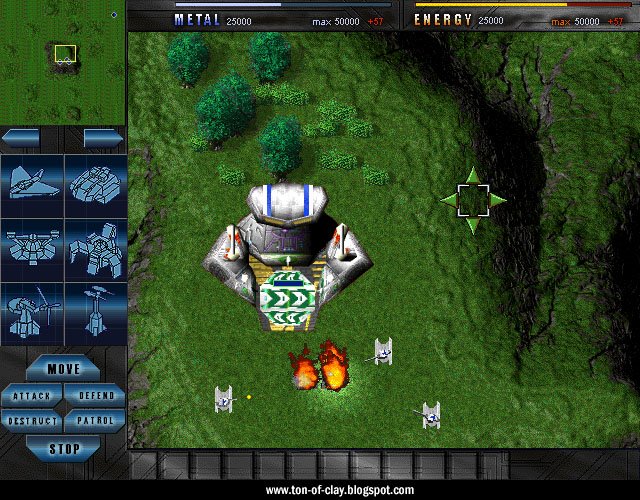
These are from January and February of 1997, or roughly the mid-way point of the production phase. This is just a month before we started making screenshots for our first print ad and our nearly nonexistent preview coverage.
It's still rough, but quite a difference from just a few months earlier. Many units will be familiar to anyone who has played the game, though some saw major changes in the months ahead. Let's have a fun "guess that unit" contest. We were briefly considering a whole heap of team symbols (including some suspiciously like lab glassware) for multiplayer, several of which can be seen here. Those were too hard to see on most units, so we just went with the basic Arm/Core insignias. The engine only supported 640 x 480 resolution at this point, which is why the UI looks gigantic and the units seem ready to crawl up your nose. Dig the groovy yin-yang on the Core Kbot lab.
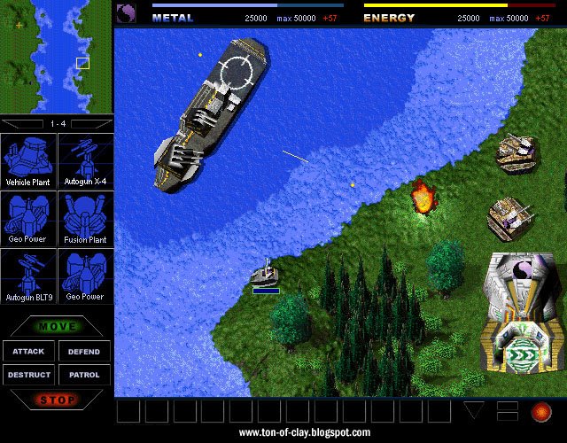
The build buttons are from a brief phase where I thought a blueprint sort of look might work. We had all those 3D models, so a simple shot of the wireframe seemed like a good place to start.
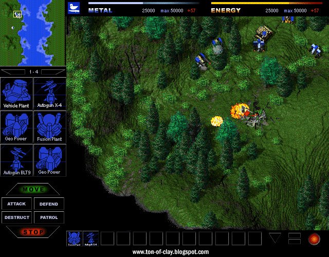 That brings up an issue we had. There were continual headaches with those itty bitty polygonal units. It was always a challenge to make them distinctive and engaging. Everybody knows what an airplane or tank looks like at a glance, but the same wasn't true for a damn K-bot lab, much less a metal storage facility. The software renderer wasn't helping much either. Textures tended to shift and "swim" a lot. Early incarnations of the engine often had polygons popping in and out of existence depending on the barometric pressure that day. We were genuinely concerned about how our little robots and gizmos would stack up against the crisp prerendered sprites found in so many other games. We knew our game would have an edge once people saw the units in motion, but we were never happy with how the units looked in static screen shots.
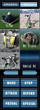 This lead to the final version of the build buttons. Ron Gilbert suggested we go with small "glamor shots" to help sell the units visually. At left is an early version of a build menu for Total Annihilation.
The "unit problem" also lead to the creation of our animated screenshots, the first of several novel ways we used that newfangled Internet thing to find and build an audience for the game.
CK
12 comments:
Wow. That's some cool stuff. But the old Vehicle plant looks like a giant blender or other kitchen appliance. :p
Yeah, it did. That's one reason why we replaced it. The other was that it was too enclosed, so vehicles kept piling up in a big heap instead of driving away once they were built.
Come to think of it that still happens sometimes.
How did the shading on the buildings come to be so fuzzy? As opposed to the more crisp shading in unitviewer and TA:Kingdoms? Was it a technical issue?
I remember seeing the Blue Buttons on a few stray screenshots.
Was it ever planned for mobile units to build other mobile units, (a la TA:K)?
I think the appearance of the buildings was part technology and partly art related.
The buildings in TA are lit with a gouraud shader then blitted to the background to cut down on the CPU hit all those polygons would have caused. That pre-lighting effectively blew out some of the detail and crispness. Lighter textures in particular can get an overexposed look. We messed around with it, but never quite got it looking as nice as we'd hoped. You can somtimes see this effect popping on and off on the buildings when they animate (as they jump from real time to a bitmap).
That technique was improved in TA:K. We also got better at working with textures. The textures in TA were really thrown together in a piecemeal way and somewhat jury-rigged. The dimensions of the bitmaps were often too big or too small for the polygons to which there were applied. In TA:K more textures were built for specific units and more care was taken with their respective sizes.
Yeah -- we did talk about mobile units building other mobile units, but didn't really pursue it. There were some technical unknowns, but if I recall correctly it was more a design choice than anything else.
It's such a pleasure to see these beta screenshots! Have you any other picures to show :)?
Hmm, I think I like the interface on the first picture better than I do in the actual game.
That is amazing, the single barrelled Flash tank and the blender looking Kbot plant.
I'm also pretty glad you didn't stay with the blueprint build pictures.
The ship in the third pic is pretty interesting, what was that?
I think that's an early attempt at a Core aircraft carrier.
Some of those gui were pretty good looking, also the title screen for TA. I agree with many others the blue print idea was good to stay away from. :D
What I liked the most was the build queue on the bottom of the screen. Was this part of the gui editable?
Editing build queues would have been great in certain situtations in the past.
Thank you, for posting the history of TA. A game that had many rts gamers hooked. Clay, your the skeev!! :D
Thanks.
The idea with the icons at the bottoms was to have a visible build queue that could be paused and rearranged with a little drag n' drop action. Like any number of ideas, that was a bit too ambitious and never made it into the game. I really wanted a translucent HUD too, but our framerate was already looking dicey at that point.
Another drawback to that design is it's tendency to gobble up screen real estate... which was a problem since many folks couldn't run the game at higher resolutions back then.
That's so awesome....you guys came such a long way, and did such an awesome job...I have to honestly say that TA was not only one of the greatest RTS games I've ever played, but one of the greatest games of any type I've ever played, period. Great job guys.
Post a Comment