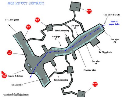
Above is the sort of crude approximation I would make for the level layout guys. This is a diagram for Main Street from the very first draft of the Voodoo Vince design doc. You might noticed one or two things called out that didn't make it into the game. But, like all our levels, it ended up being much more rich and detailed than my rudimentary, blocky concept. John Baron and Joe Mullenix added incredible hidden tunnels, strange knick knacks and controller-crushing platform challenges. The artists went on to make it cool, beautiful and filled with all sorts of inside jokes and visual puns. More on that later.
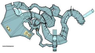
 This is a simplified shot of the final geometry for Main Street. Anybody who played the game and got lost there can now see why. I always thought the top-down shots of our levels had a very intestinal look, which makes sense since Vince usually goes in one end and out the other.
Bon Appétit!
CK


No comments:
Post a Comment