Sunday, October 15, 2006

TA-ncient History #6: First Ink

Copyright 1997 - Imagine
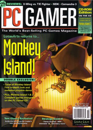
Ironically, a sequel to our producer's most famous game graced the cover
of PC Gamer the same month as the first Total Annihilation preview.


Getting the press interested in yet another real time strategy game in 1997 was no easy feat. Approximately 24,000 RTS games came out that year. A new game from an untried studio wasn't exactly catching the eye of editors and journalists. The glut of RTS games created intense competition for the hearts and minds of gamers. Some publishers were putting big money behind promoting their entries.

Many upcoming games engaged in what I call bullet point warfare. Lists of features and visual gimmicks were dutifully recited in prepress coverage and endlessly compared and debated by the nascent Internet community. A week didn't passed that some helpful person would come into our office and say "Gosh, this game XXX from XXX has unit morale, cyborg pez dispensers and dancing pie charts showing alfalfa comsumption... Do we have morale, cyborg pez and pie graphs?" We did what any good developer does when asked about stuff like that. We completely ignored it and concentrated on making the game.

Our ship date had floated around for about a year. We changed it twice, but by the spring of '97 we were finally pretty sure we would RTM (route to manufacture) in September. Ship dates don't seem as stressful when nobody knows you exist. We were getting a little anxious, though. US game magazines had a lead time for stories of three to five months -- some still do in spite of competition from gaming websites. That's pretty simple math. It was already March and we still weren't sure how the world would ever hear about Total Annihilation. We had that spiffy print ad figured out, but E3 was just around the corner. We needed to make at least a decent splash or Total Annihilation would be in the bargain bin before Christmas.

Word finally came down that we would get a preview story in PC Gamer (US version). A staff writer from San Francisco would come to the Humongous/Cavedog offices in glorious Woodinville, Washington. We were told the plan was for a one page write-up in their preview section. We geared up by pushing even harder to make the game presentable (old multiplayer UI below) and to create high resolution assets for our future marketing needs.


It wasn't enough that we already had maps bigger than any other RTS game. We had to do something truly awe-inspiring... something that would astound and amaze. Ron, Chris and I jointly conceived of Boris, a 100x100 screen behemoth (Editors note: See next post). Maps that size are no biggie to the TA 3rd party community these days, but we attempted this with a mere P200 with 64 megs of RAM. I stayed up for days rendering and assembling pieces of Boris. The stability of the engine was still fluctuating from day to day. We didn't really know what would happen.

It's pretty obvious what happened: My PC went into shock and curled up whimpering in the corner for days after my first attempt to load Boris. After those days of sleep deprivation and stress, I still shudder when I hear that name. We had to make do with our regular maps, which served us perfectly well.

There is an expectation that games are built using piles of slick concept art. It won't do to give magazines some doodles on a stained burger wrapper. Nope. Concept art has to look like it came from the halls of Skywalker Ranch or Ridley Scott's wet dream. The visual standard for games today makes walls of concept art a common sight. We didn't have much stuff like that for Total Annihilation. The design for a 40 polygon tank isn't much to look at.

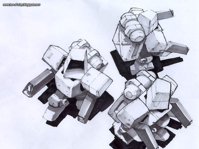
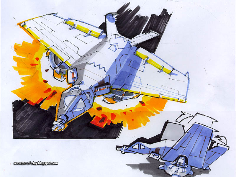
So, we faked it. We had some great artists who were fully capable of making froo froo art like that. We were just too busy to make it most of the time. But it looks swell in a magazine article, so Kevin Pun (another Square alum) whipped up some nice juicy marker comps of units after they were already finished and in the game. Here are his wonderful, tarted up takes on some TA units.
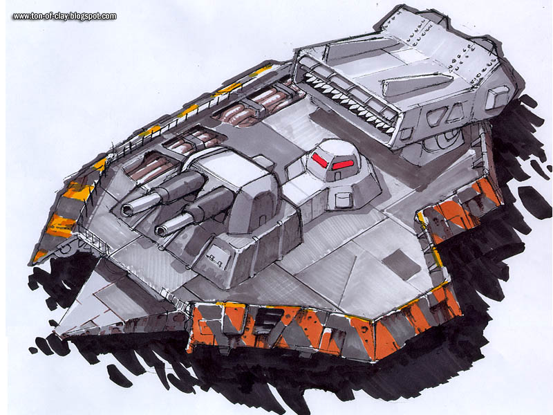
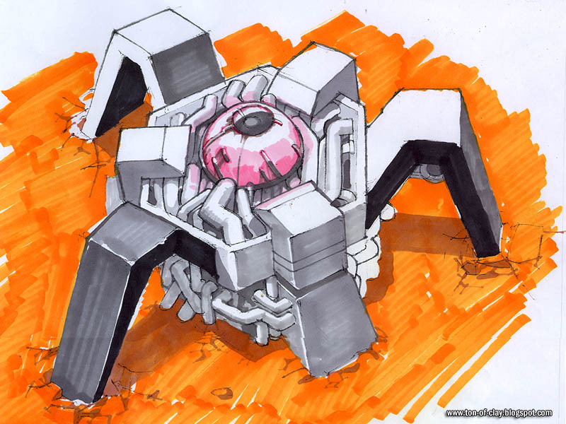
PC Gamer never used these for that piece, but they were handy for other articles and interviews that came along later. We fed the marketing and PR machine at GT a steady stream of high resolution renders and more concept art for months to come.

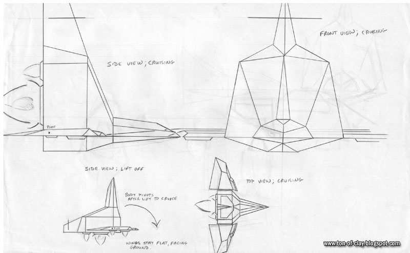
Our real unit designs were certainly nicer than something on a burger wrapper. Below is a real first design pass for a Core aerial unit by Mike Fisher, the artist responsible for the bulk of the Core units. I usually asked for a quick pencil treatment so I could sign off on a unit design before the unit artists waded into 3D land. Mike always worked with wonderfully clear schematics, worthy of an engineer.

It would have been about April of 1997 when Michael Wolf from PC Gamer paid us a call. Michael was a reviewer who later became the disk editor of PC Gamer. Michael is now a PR manager over at Microsoft's Windows game division. He arrived late in the morning. My impression was that he may have expected yet another C&C clone and I can't blame him. As we showed off our game he seemed to grow more impressed and excited as the interview progressed, asking lots of good questions.

Ron, Chris, Michael and I piled into Chris's Mazda 626 and went to lunch at a local Chinese place. I only remember that because I have a strong recollection of ignoring my wonton soup while riffing on the notion of the Core Commander writing a lonely hearts advice column. That later made its way onto the Cavedog website as a semi-regular feature.


If you read this early coverage, you'll notice Ron's name sometimes comes up more than Chris's. His name is the only one mentioned in the table of contents above. The industry at large hadn't really heard of Chris, Cavedog or our game yet. Ron was an acknowledged industry heavyweight. His background as a design god at LucasArts and the upcoming Monkey Island sequel (though unrelated to Ron) sometimes made him a focus for journalists who came to look at TA. Ron was always gracious and pointed reporters right back to Chris. He really believed that a designer should speak for his own game.
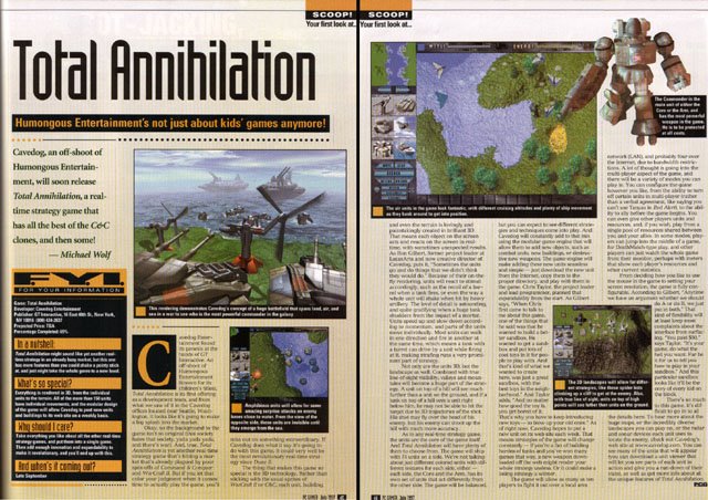
Copyright 1997 - Imagine
I almost forgot about the button layout that sort of looked like a skull. Oooo... Spooky.

When the preview finally hit magazine stands in their July issue (on the street in June) we were amazed. It was as nice as a preview gets. Phrases like, "...it could very well be the most revolutionary real-time strategy since Dune II" had us pinching ourselves (we did that to stay awake anyway). The timing couldn't have been better. This was the edition of PC Gamer that was circulated at E3 that year. Our ad was in other major game publications that month as well.

We had plenty of good buzz going into E3. Now we just had to get the game halfway polished for it's big debut on the show floor.

CK

Friday, October 13, 2006

A Tangled Rope

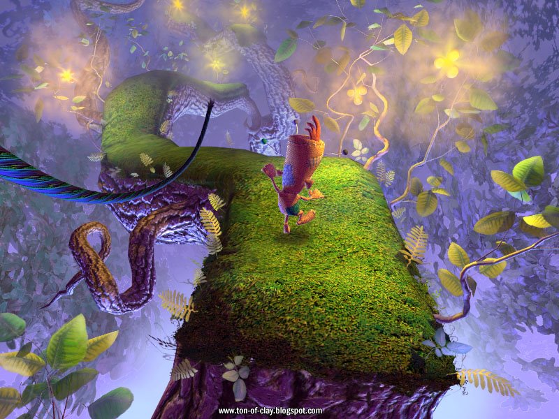
This is the last of the visual prototype images we brought to the Voodoo Vince green light meeting. Just about every picture shows Vince doing something different. We felt it was important to show as much variety as possible by putting Vince in a variety of settings and in an assortment of vehicles. Here we see him swinging his way though a fanciful forest canopy. Of the four mockups, I think this is one of the prettiest. It's definitely in the top four.

During the creation of this picture Gary Hanna jokingly referred to all the bright, radiant plant things as "glowberries." We didn't really have glowing bits like that in the final version, but that did provide part of the level's name, Glowberry Tangle. For players who don't like bottomless pits (and there are many), this level was pure hell since the whole thing is one big bottomless space with thin, twisty tree limbs to land upon.

Different modes of travel always create interesting issues for art, design and technology. Keeping the camera under control, physics, strange clipping and character behavior all present different challenges. This visual test depicts a cable-like vine for Vince to swing on. We soon found that making a polygonal model look convincing as a rope (in real time) is pretty damn tough. A solid rope object also did some odd things when it passed around or through the in-game camera. We opted for a string of stretchy particles instead. This avoided strange rope malfunctions and pulled Vince away from the camera quickly, which helped to avoid clipping and a loss of orientation.

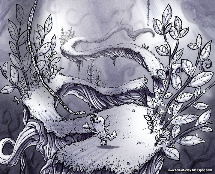
Original take on the Glowberry "perfect world" image by Doug Williams

The illusion of distant foliage in Glowberry Tangle was done simply by wrapping the level in some layers of leafy texture, forming a surrounding tube of sorts. Again, the original take on this didn't work out. The original has a light, distant sky layer with a slight gradient to it. This tended to make the leaf backdrop stand out more, and look more fake. The brighter, more intense backdrop also competed too much with the branches and landing places, making an already challenging level even harder. So, the final version (again) made use of a simple dark backdrop with the distant tube o' leaves mostly obscured by distance.

A skilled player can breeze through Glowberry tangle in mere minutes, never suspecting the long list of boring decisions that went into its creation. That sort of makes me wish a "directors cut" of a game were possible, with running commentary so players could be made aware of the developer's self-centered, long winded thoughts. That wouldn't work for me as a player, though. I'd probably get distracted by some comment about the code or art while a monster is going to town gnawing on my leg.

CK

Wednesday, October 11, 2006

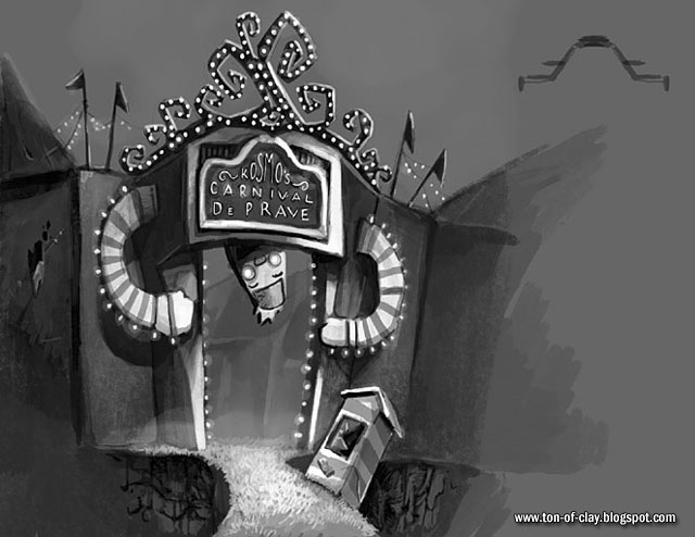
The Carnival DePrave


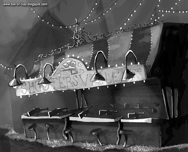
Nothing beats a worn out, deserted carnival for sheer atmosphere and spooky good times. The level artists did a great job creating Kosmo's base of operations, the Carnival DePrave. This was the final location in Voodoo Vince. Once the level designer John Baron finished laying out the platforms holes and the structures, Doug Williams created these superb black and white mood pieces. The level artist (also John Baron, come to think of it) worked from these to create the final level art.


Hmmm... In retrospect, the entryway to the carnival has a somewhat goatse-y look to it. Shame on anybody else who thinks that.

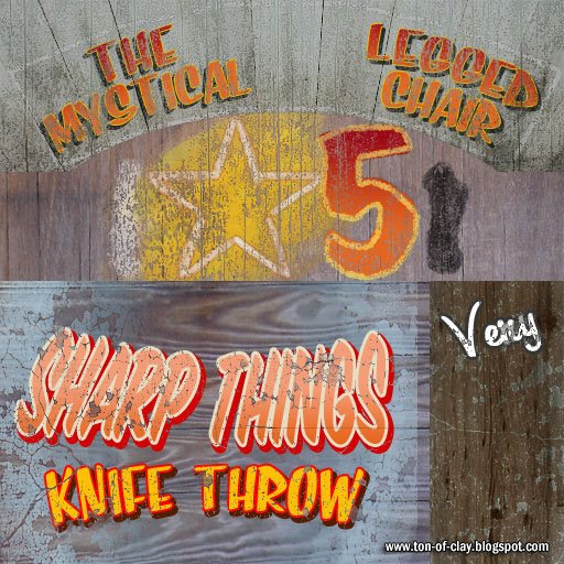
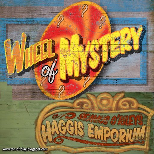
Every level in a game like Voodo Vince is a big accomplishment, but each one is filled with reminders of things that might have been. The Carnival DePrave was, if anything, a bit too empty and deserted. I had hoped to fill the booths on the midway with playable minigames. But our ship date was looming. The mini-games ended up as static pieces of background art, but you can still see the original idea thanks to the textures in the level. John Baron thought up most of the games while doing the initial level design.

The final in-game textures were given a wonderful air of festive decay by Dan Cole. You can almost smell that bilge water taffy.

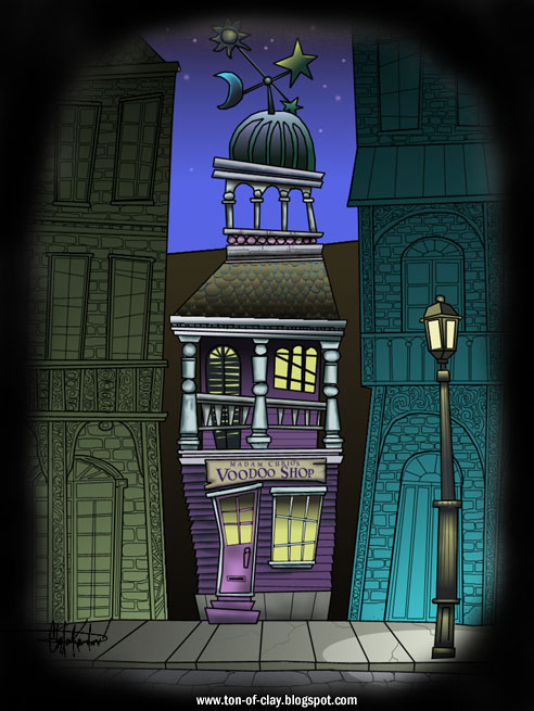
I can only imagine what sort of bent mischief these might have turned into. All you super elite Ton of Clay readers will notice that Madam Charmaine's original name makes a slightly modified appearance. All of these images incorporate bits and pieces of walls we photographed in and around New Orleans.

CK

Sunday, October 08, 2006

Homespun Voodoo

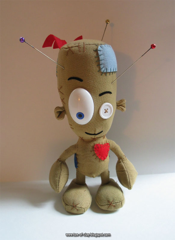
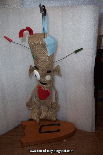
The incredibly rare Voodoo Vince doll. These have sold for millions of dollars on eBay.

The most common question I get via the Beep Industries website (next to "Are you guys dead?") is from people who want to know how they can buy, beg, borrow or steal a bona fide Voodoo Vince doll. We would have dearly loved to see vast heaps of shoddy Vince merchandise, dolls included, but that was not to be.

A Vince doll was made (above), but it was mostly sent to members of the gaming press. The crew at Beep and some of the Microsoft people snapped up the rest. It couldn't have been more than 100 or so dolls, total. I managed to get three. One is on the shelf in my office. Another is being kept in its wrapper for my kid when he's old enough to really enjoy long, pointy pins.

Speaking of which, one sad aspect of the promotional dolls is that they didn't include Vince's pins due to the usual hand-wringing and liability concerns. Vince without his pins is, well, just a doll. The pins you see on my doll were made by my good friend Patrick Hoynes. He melted authentic Mardi Gras beads onto antique hat pins, creating pins as lovely as they are dangerous. That earned Pat the third doll from my small supply.

It's sad. Given the lukewarm reception Vince had in some quarters, those dolls would have been better off in the hands of eager Vince fans. Maxim magazine mailed theirs as a gimmick to a random recipient. I stongly encourage indifferent members of the gaming press to put theirs up for sale on eBay. Contrary to my caption above, you will only make a few bucks but it would help to right a great wrong and restore balance to the gaming nerd cosmos.

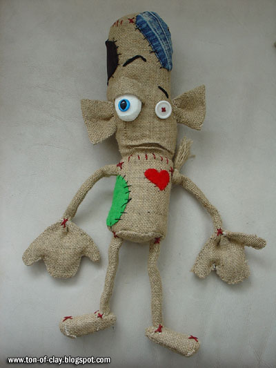
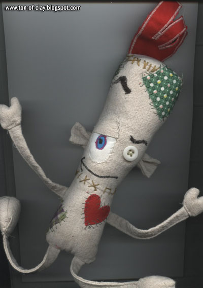
This lack of dolls hasn't dampened the spirits of determined Voodoo Vince fans. Since no Vince merchandise exists, they've made their own. Over the last few years I have received some great pictures (and one actual doll) from fans who have made t-shirts, artwork and quite a few home-made Vince dolls. No mass produced chotchkey will ever match these for personality, warmth and all-around coolness.


One lucky Vince fan received this statue for her birthday from her very talented son:


I have to smile every time I look at these. When I think about the hours these must have taken to create, I'm simply amazed. This proves that an idea can live on in the hearts of gamers long after the machines that play them have been converted to goldfish bowl case mods - with or without the help of marketing.

This final image by a grade schooler is better than any sign-off I can think of.


CK

Thursday, October 05, 2006

TA-ncient History #5: The First Ad

Some of you old timers might remember the first print advertisement for Total Annihilation. I think that ad scored a first for Cavedog. Or a close second... maybe third. Definitely no more than sixteenth overall. I'm positive.

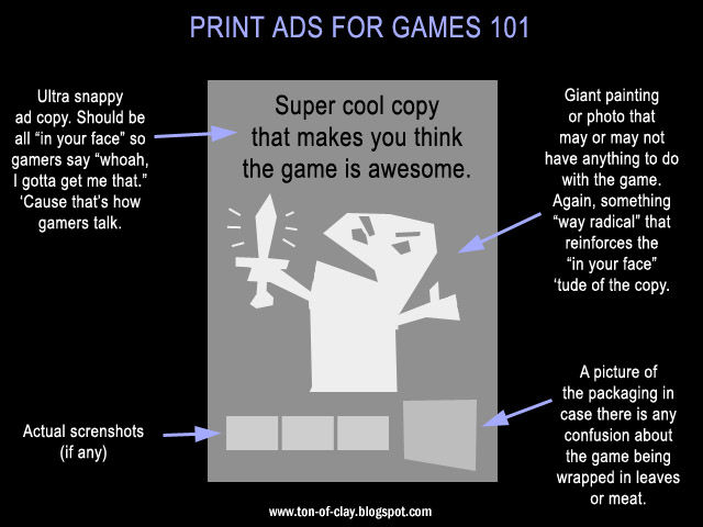
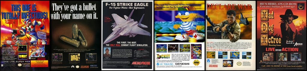
Y'see, print ads for games almost always followed a time-honored format. Crack open any game magazine from before 1997 and you will see that the advertisements are remarkably homogeneous. They all looked something like this:

This dates back to the time when game art was relatively crude, so some sort of swanky art or a big juicy photograph would be used to build an image for a game. The game itself usually couldn't do that. A character with only twelve pixels just doesn't have a lot of presence.


The thing is, game ads still looked like that decades later, even after in-game art started to look reasonably slick. It's a common design even today. I don't blame ad agencies for doing this. I'm sure they can crap out nineteen of these in a single afternoon and still have time for some blow and a round of golf. And to be fair, it's a pretty common approach to any print ad. It works for selling lotion and cars... Why not games?

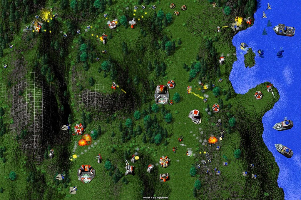
That is exactly the sort of ad the marketing firm working for GT Interactive showed us when they came by in early 1997. We hated it immediately. We knew the game would have only one or two print ads before it launched and we wanted them to have maximum impact. Chris and I were adamant that we sell the game with the game. We insisted that the ad feature a full two-page screenshot.

I don't recall seeing this before. It's not like we thought it up. It was just a matter of time before giant screenshots became commonplace, but Total Annihilation was certainly one of the first games to do it. There was some resistance from the agency. The concern was that (gasp!) the pixels would be visible since a computer game couldn't match the print resolution of a magazine. That sounded fine to us. It would absolutely show gamers what they were getting.

We did have one advantage. GT Interactive owned the fold-out ad space inside the cover of all the major PC gaming magazines for a couple years running. This prime real estate was mostly used for big versions of the standard formula above, but we would get that spot for one or two display ads before the game hit store shelves. Chris, Ron and I wrote the basic copy which the ad folks polished up a bit. I did a rough layout then went to work creating a big, big screenshot. Here is the original image:

Okay. This was the original image, but Blogger crunched it down quite a bit.

A few months later, Total Annihilation would later have a built-in screen shot key command. We could take snapshots like this with no problem - but we didn't have that feature at this point. I had to take a series of smaller shots and drop them onto the original .PCX file we imported into our map editor. I took a second shot with the mesh view enabled and did a small mask reveal in Photoshop to communicate the 3D-ness of the terrain.

It had the desired result. Between this ad and our first preview coverage in PC Gamer, we went to E3 in 1997 with lots of good buzz around Total Annihilation. Several competing RTS games had print ads almost identical to this (including the landscape mesh) within a year. Giant full page screenshots are pretty commonplace now, but you still see plenty of that Game Ad 101 ethic between the pages of magazines to this day.

CK

Tuesday, October 03, 2006

A Family Portrait

I always liked this one. It really helps to give some idea of how much content is created even for a modest game like Voodoo Vince. Just about every character is here, except for a couple of the zombies from the Zombie Guidance Counselor level (though zombie football player and zombie chef are representing for the team). One of the doomed critters from the Sausage Factory might be missing too, but that's understandable.

This picture was used in the Voodoo Vince preview in Play Magazine, and on the back tray of the official soundtrack CD, but hasn't been shown much outside of those things. The characters were done by the Beep animation crew (based on Doug's concept art, of course). Gary Hanna did the rendering using Mental Ray.

CK

Monday, October 02, 2006

TA-ncient History #4: Dogs, Yaks & Boron


By the Spring of 1997, Total Annihilation was shaping up nicely and the public was about to get its first glimpse of the game. Our first magazine previews, print ads and E3 were just around the corner. We'd known from the start that the game couldn't be released under the wholesome family-friendly Humongous label. It wouldn't make sense for their audience, or the one we were hoping to reach with TA. This didn't stop some of us from drawing pictures of Putt Putt bristling with guns. A new name and a completely different image would be required.

Chris and I tossed around ideas for names from the start, but nothing jumped out at us. We opened it up to ideas from the whole company.

I compiled all the suggestions that rolled in. We heard some standard software developer-ish sounding names with "mega" and "soft" in the name. A couple programmers raided the element chart, submitting ideas like "cobalt" and "boron" Since we worked in the Pacific Northwest near Seattle, we heard plenty of pleasant names incorporating rain, fish, mountains and more fish. After sifting through these, Chris and I narrowed it down to two choices: Cavedog Entertainment and Frozen Yak Entertainment, both of which were his contributions.

We liked both names. I did some crude doodles in my notepad during a meeting.

I fleshed them out a bit more at home that evening. Here is a rough Cavedog.


These two pictures were pinned up on the wall of the office Chris and I shared. It was put to a vote, and Cavedog won by a narrow margin. The pooch was ready for prime time. That sorry looking Frozen Yak wasn't completely lost. It was unearthed as part of an April Fools joke on the Cavedog website about a year later.

The Cavedog logo ended up on all the usual things like business cards, letterhead, hats and the all-important t-shirts. I've done a lot of logos over the years. I still think this is one of my better efforts. I wanted to evoke paleolithic cave paintings, while keeping the lines simple enough to stand out, even when printed very small.

It did. I was relaxing at home in 2000, watching my favorite family entertainment, The Sopranos. It was season two, episode seven... the one called D-Girl. Toward the end of the episode, Sal "Big Pussy" Bompensiero was having a heart-to-heart with AJ in his room when something in the background caught my eye.

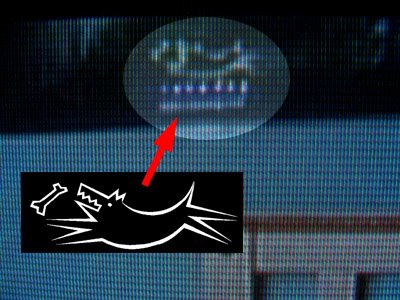
Could it be? A TA: Core Contingency poster in AJ's bedroom?

It is! You can just make out the Commander to the right, but the Cavedog is plain as day.

And there you have it. My small supporting role in television history. It's fitting that the Cavedog shared some screen time with the Big Pussy character, since both would be bumped off within the year.

CK


Friday, September 29, 2006

The Lure of The Shrimp Sub

Copyright 2001 Microsoft Corporation

This is the third of the four 3D concept pieces created for the Voodoo Vince green light meeting. Once again, Gary Hanna and his crew did a spectacular job. This portrays Vince in a mini-submersible shaped like a shrimp. It's funny how wonderfully clear the water is. It's like a tropical reef rather than the incredibly murky water one really finds in the bayou country. Real swamp water slooks like unfiltered apple cider, teeming with countless bugs and reptiles. But hey, zero visibility wouldn't be much fun in a game.

I mentioned the four "perfect world" pictures earlier, but I figured I'd talk about them a little more. After a year of meetings, rejections and building a demo we finally landed a deal with Microsoft. We didn't dive into production right away. There was a prototype phase first. We had six months to create a bigger, better, more detailed version of the demo, finish a first draft of the comprehensive general design doc (GDD), and initial draft of the technical design doc (TDD), and a detailed milestone list for the whole project with tasks, assignments and workflow charted out. We also needed to establish how the game would look. All this was wheeled into a conference room for the meeting. These images were brought in on 2 by 3 foot enlargements mounted on foam core (which delighted MS execs promptly snapped up).

The purpose of pictures like the one above was to allow Gary and his crew to create something that approximated how the finished game would look without bogging down the prototype itself. The theory was that we could then make the prototype visually crude and concentrate on gameplay.

That's a nice theory, but we ended up making the prototype as visually strong as we possibly could. Visual polish is a double-edged sword. Everybody says they can imagine how things will look in a rough version, but the inevitable "That's not final art, is it?" question is the bane of artists throughout human history. You just know it was said of the Lascaux bison. On the other hand, if you work too tight you can paint yourself into a corner, visually speaking. We decided to err on the side of polish. Voodoo Vince at six months looked better than a lot of finished games.

That paid off in the green light meeting, though we still had a lot of content to create before the game crossed the finish line.

CK

Wednesday, September 27, 2006

The Vince Storybook

"In the darkest corner of the oldest voodoo shop in the French Quarter of New Orleans was a doll made of rags, twine, burlap and strange unspeakable things. He was named Vince."

My experience in the game industry has taught me that most people don't read... even all-wise, benevolent publishers are sometimes too busy to wade through a long wordy document. I decided to make understanding Vince as easy as possible for busy executives with too many concepts to evaluate. I wrote what amounted to a children's book and put it in the first concept/pitch doc for the game. This may be why I still hear from parents who say their kids are crazy about Voodoo Vince.

Vince's appearance didn't change too much from these early concept pieces.


Kosmo and his goons (Jeb and Fingers) are much as they appeared in the game almost three years later.

Curio (above) and the roustabouts (above right) by Doug "Mr. Prolific" Williams.

The biggest changes were made to the Madam Charmaine character. She was originally called Madam Curio. We changed her name once we discovered there was a professional dominatrix using that moniker (gosh... thanks, Google). We also went with a somewhat younger look for her.


This approach was really well received. It opened doors and led to many upbeat meetings with publishers. I found that just about everybody "got" the idea behind the game. Everybody was enthusiastic about the concept too, but that didn't loosen any purse strings. It took a playable demo to accomplish that. But it was still a great way to establish some basic elements for Vince and his world.

CK
Tuesday, September 26, 2006

TA-ncient History #3: Mid Nano-Stream

Backdrop for a temporary title screen - Fall of 1996

Total Annihilation came together fast. Really fast. The bulk of the game's code and content was created in less than a year. I credit this to two things: insane work hours and a good preproduction phase.

Preproduction is frequently overlooked and underestimated by publishers and game developers, even today. Taking the time to figure out tools, techniques and a look for a game sounds like good sense, but it is often written off as indulgent fluff. It doesn't always feel like you're producing something, and it's sometimes hard to show that you are (especially to a stressed out executive) but preproduction is incredibly useful. It gets a solid production pipeline in place, and makes it easier for a small core team to share the Kool Aid and quickly indoctrinate new recruits. I firmly believe that every week of preproduction saves at least three weeks of regular development time. It's true. I have notes.

By the Fall of 1996 we were gearing up for full production and adding staff in a hurry. A lot had happened by then. We had figured out our excuse for a story. We had marginally functional tools. We started getting a good feeling about the game.

We also had a new publisher. GT Interactive bought Humongous Entertainment in July of 1996. Chris and I had no clue that was going to happen. Saying we were surprised is putting it mildly. Total Annihilation was started under the auspices of a mom n' pop, bootstrap operation and now it belonged to some guys in New York. Stuff like that happens in business, but there were some moments of stress and consternation.

GT (originally initials for "Good Times") was as surprised as we were. When they bought the makers of Putt Putt, Freddi Fish and Fatty Bear, they were only marginally aware that an RTS game was lurking somewhere in the building. It seemed like a good match. GT had risen to be the third biggest game publisher by distributing Doom, Quake and Duke Nukem. Total Annihilation looked like it might be a good fit for them. The game would certainly get better distribution than it would have before the acquisition. Funding for TA's completion would also be on more solid ground. We did a quick demo for some GT Interactive execs about a month later and they seemed to like what they saw. So, it was full steam ahead.

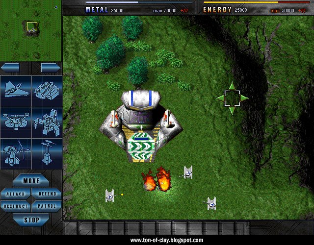
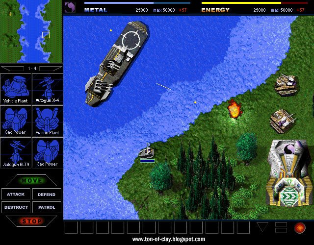
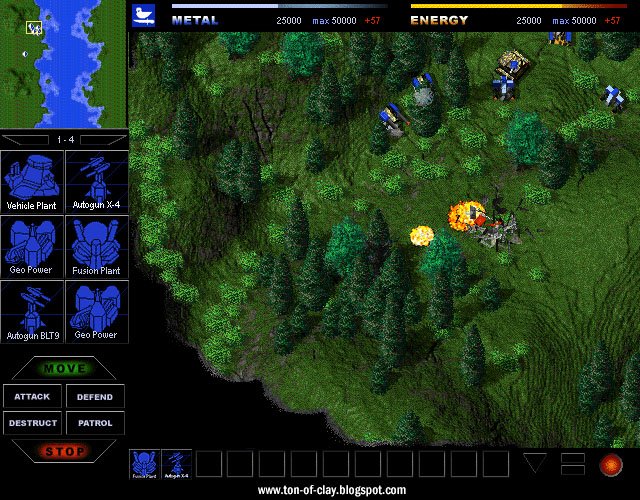
These screens are mockups from a time when different interface designs were being considered (though the maps and units are all legit). That's why there are structures and vehicles all mixed up on the same menu.


These are from January and February of 1997, or roughly the mid-way point of the production phase. This is just a month before we started making screenshots for our first print ad and our nearly nonexistent preview coverage.

It's still rough, but quite a difference from just a few months earlier. Many units will be familiar to anyone who has played the game, though some saw major changes in the months ahead. Let's have a fun "guess that unit" contest. We were briefly considering a whole heap of team symbols (including some suspiciously like lab glassware) for multiplayer, several of which can be seen here. Those were too hard to see on most units, so we just went with the basic Arm/Core insignias. The engine only supported 640 x 480 resolution at this point, which is why the UI looks gigantic and the units seem ready to crawl up your nose. Dig the groovy yin-yang on the Core Kbot lab.


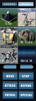
The build buttons are from a brief phase where I thought a blueprint sort of look might work. We had all those 3D models, so a simple shot of the wireframe seemed like a good place to start.

That brings up an issue we had. There were continual headaches with those itty bitty polygonal units. It was always a challenge to make them distinctive and engaging. Everybody knows what an airplane or tank looks like at a glance, but the same wasn't true for a damn K-bot lab, much less a metal storage facility. The software renderer wasn't helping much either. Textures tended to shift and "swim" a lot. Early incarnations of the engine often had polygons popping in and out of existence depending on the barometric pressure that day. We were genuinely concerned about how our little robots and gizmos would stack up against the crisp prerendered sprites found in so many other games. We knew our game would have an edge once people saw the units in motion, but we were never happy with how the units looked in static screen shots.

This lead to the final version of the build buttons. Ron Gilbert suggested we go with small "glamor shots" to help sell the units visually. At left is an early version of a build menu for Total Annihilation.

The "unit problem" also lead to the creation of our animated screenshots, the first of several novel ways we used that newfangled Internet thing to find and build an audience for the game.

CK